


CityPups
Connecting City Dwellers With Their Ideal Dog
Citypups is a pet finder website that I designed as part of a 5-day UX sprint hosted by BiteSizeUX. I was given a project brief and a task to complete daily.
Role: Solo UX Designer (UX Research, UX, UI Design, Information Architecture)
Duration: 5 days
Problem
City dwellers don’t feel confident adopting a dog because they are not sure which dog is best suited for their lifestyle. They want to make sure it’s a good fit for not only them, but also the dog.
Meet Our User
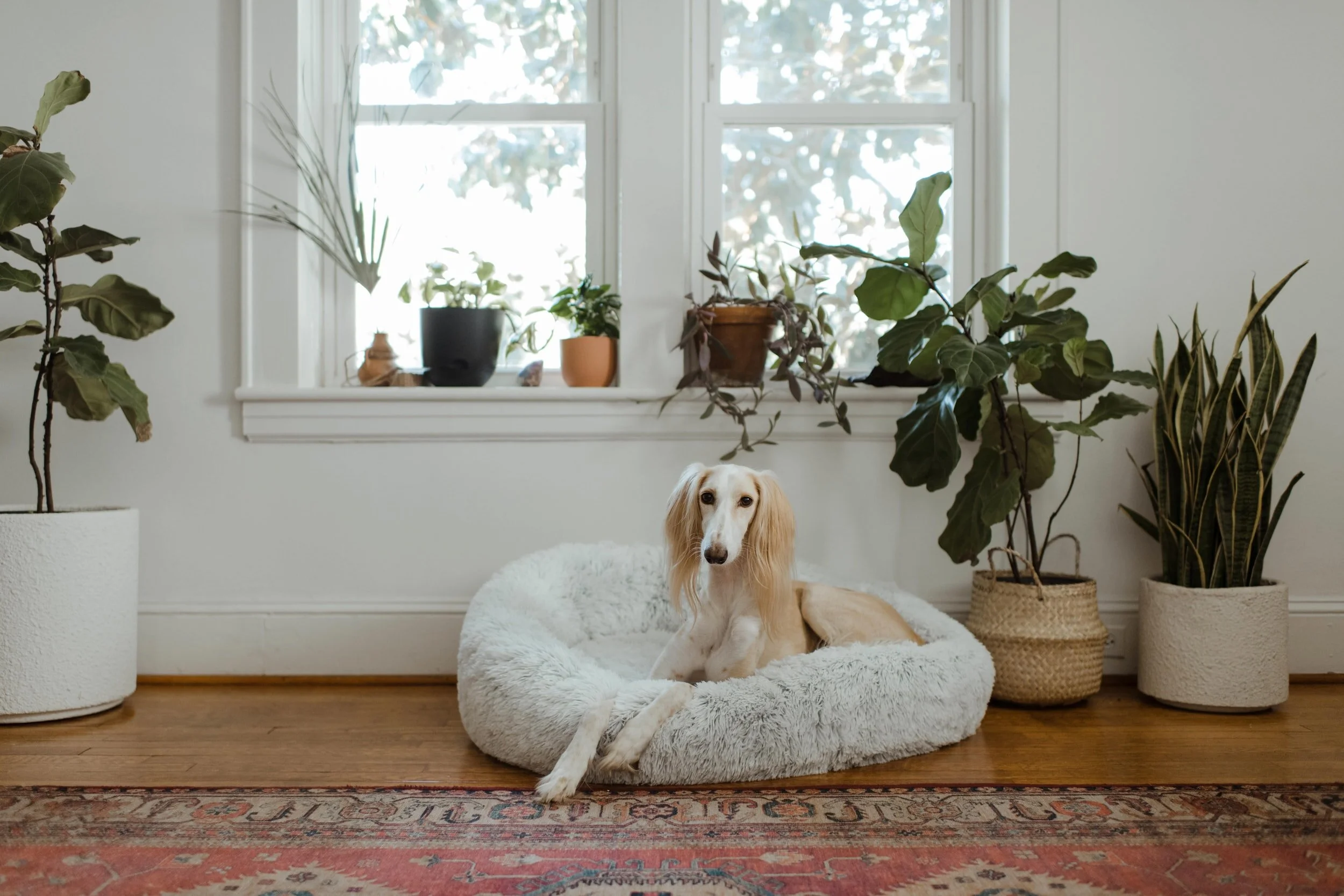
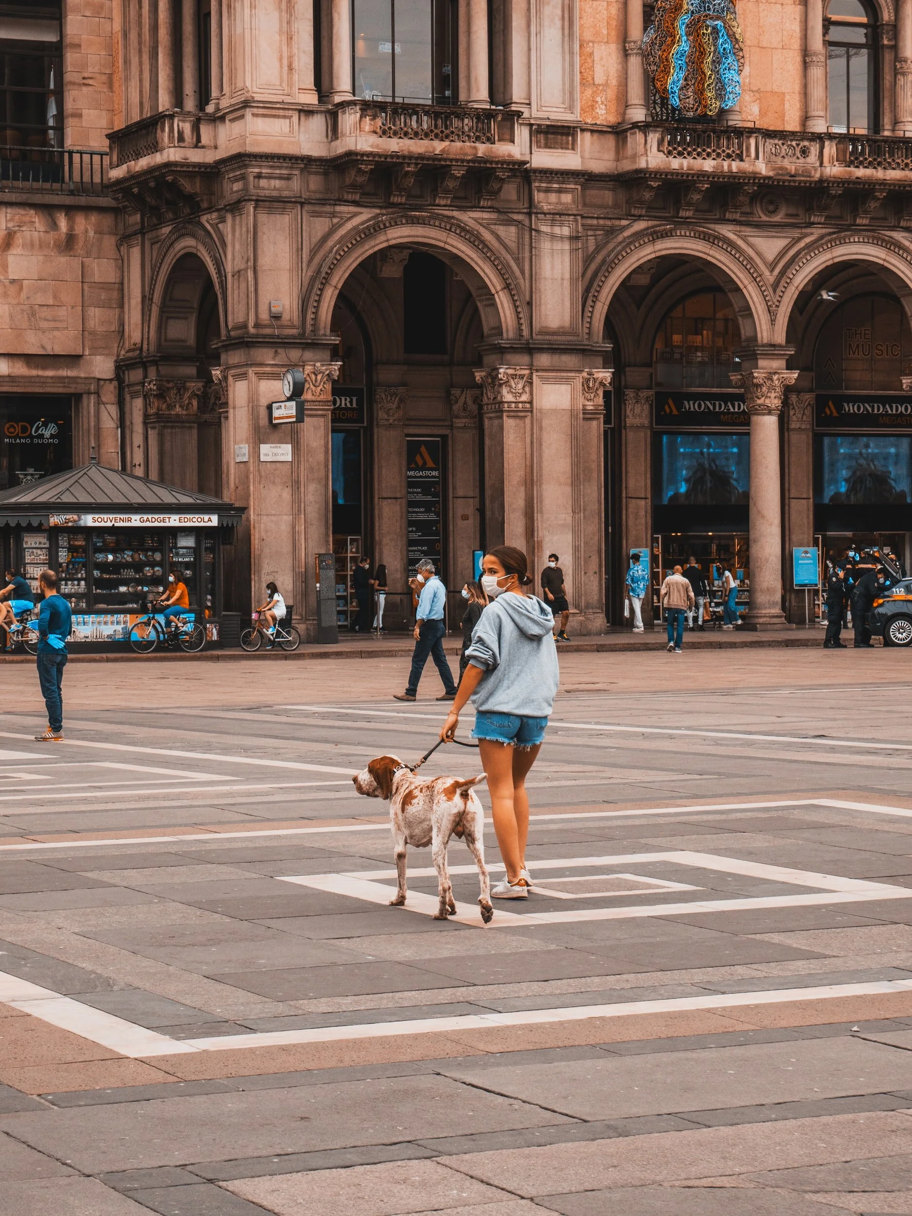
Ellie is a 27 year old female living in New York City. Since she lives in a small apartment it’s important for her to find a small dog that doesn’t bark a lot. She doesn’t have a car so she would like to find a dog that’s within a few miles of her location. Lastly, the dog must be good with children because she has nephews and nieces that come over.

Ellie is a persona created by BiteSizeUX.
Pain Points
Information about dogs is not descriptive enough
For example, how small is a “small dog”?
Minimum radius on adoption sites is too high because she doesn’t have a car
For example, 25 miles is not feasible when the user doesn’t have a car.
Wants a dog that’s good with children, but it’s difficult to determine the temperament of a dog based off of only pictures
Time consuming to speak to adoption agency representatives or to visit the adoption sites herself to determine the personality and requirements of each dog

How might we help people living in cities find a dog that matches their unique needs?
Key Features to Improve User Experience

Videos to View Dogs’ Personalities
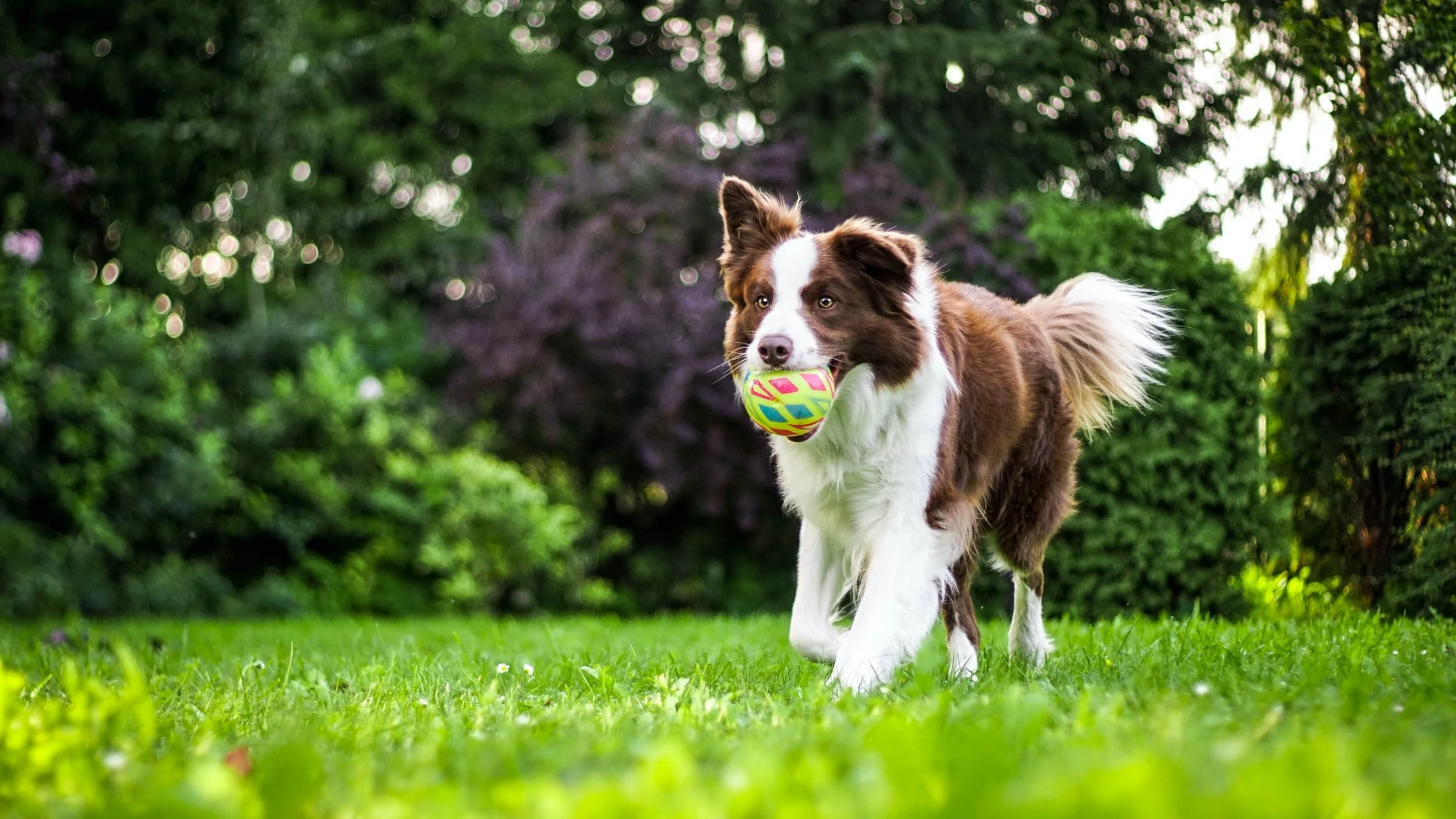
One of the main concerns of someone wanting to adopt a dog is the dog’s temperament. The video can show not only the temperament of the dog, but also shows any abilities the dog has (can play fetch, swim, etc.). Also, users expressed that a video shows that the dog is real.

Map To Search Dogs Nearby
Many people living in the city don’t have a car. The lowest search radius on many pet finder websites is 50 miles. This would require the person to rent a car in order to visit a dog.

Personalized Search Results from Quiz
The quiz allows the user to filter their options by answering questions about themselves and their preferences. This will help prevent overwhelm and hopefully provide better aligned matches for the user.

Day 1
User Map
Minimum Viable Product: Quiz that helps users and dogs find an ideal match of lifestyle and personality

Day 2
Inspiration

Airbnb
Map view and results alongside
eHarmony
Progress bar
Personalized results from quiz

Crazy 8’s Exercise
In this exercise, I created 8 quick sketches for the principal page. I enjoyed this exercise as it encouraged me to not overthink because I only had a set amount of time to complete the exercise. Many times I think our best work comes when we let ourselves create without editing simultaneously.
Day 3
Storyboard

After brainstorming some ideas of what the principal page could look like, I decided on combining a few of the screen ideas together. From there, I created the other screens important in the user flow of finding a dog to adopt.
My goal was to make the experience intuitive and simple by answering one question at a time. There is also a minimal design to prevent overwhelm.
Day 4-5
Prototyping, Usability Testing & Iteration

Challenge
Some of the users still weren’t sure how much responsibility would be required of them based on which energy level they selected.

Solution
Below each energy level, I added a description of what would be required of the pet owner to have a dog of a certain energy level.

Challenge
Special needs are on a spectrum instead of a definitive yes or no.
Since the user only had two options when considering whether to adopt a dog with special needs, many of the users answered ‘no’.
However, some users expressed they would be open to adopting a dog with minor or moderate special needs.

Solution
I decided to integrate a slider into the design for a user to answer their level of comfortability adopting a pet with minor, moderate or major special needs.

Challenge
A user wasn’t able to edit their answers once they finished the quiz.
Also, users weren’t sure how to change the city.

Solution
A button for filters selected was added. The user can click on this button and deselect any filters they selected during the quiz.
Also, I added an ‘X’ so the user could delete the city name and enter another one.
The Full Prototype

Retrospective
This design sprint challenged me to focus more on the User Experienced instead of having a pixel perfect design. I enjoyed the experience of creating a quick prototype to receive immediate feedback. It proved that functionality must come before beauty.
The usability tests were a humbling experience as I encountered the same issues from different users. Overall, the feedback to the website was positive. Many users stated it was simple to use and intuitive. They appreciated that they were not bombarded with information on the homepage.
The final design still has a lot of room for improvement, but the design sprint was a great exercise to focus on solving the user’s issue without getting caught up in the aesthetics.